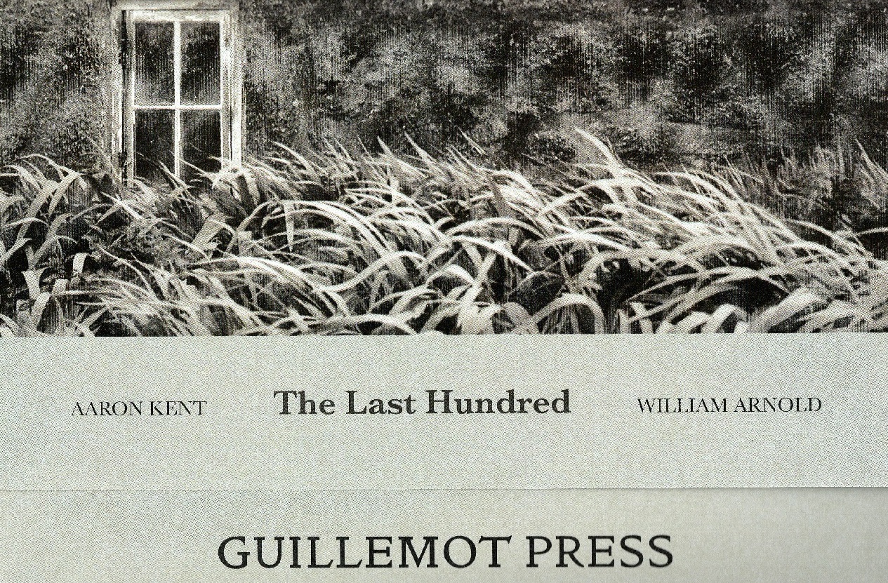
When the poet Jen Hadfield was resident in the Charles Causley house in Cornwall we went for a walk to St Clether’s holy well chapel on the north-eastern edge of the moor. It was following this walk that Jen wrote the poem Notice, which we letterpress-printed on 24th May in an edition of just 30 for the 2019 Bodmin Moor Poetry Festival.
The Chapel
To get to the well chapel you wander through the churchyard of St Clether and along a path in the hillside above the River Inny, the way marked by a wooden cross.
The saint to whom the well is dedicated is essentially unknown, although most websites say that Clether was founded by one of the dozens of children of the 5th century Welsh King Brychan; a son named Cleder or Cledrus, who followed his brother Nectan to Cornwall. Others say that Clether was the 1st century Bishop Cletus, a Roman who became the third pope. Another associates Clether with the 9th century Mercian warlord Ethelred, and we might as well add his contemporary and namesake, Ethelred the King of Wessex, to the list of (im)possibilities.
The current well chapel was built in the fifteenth century on those ancient foundations and has been renovated numerous times, including by Sabine Baring-Gould at the end of the nineteenth century.
There is a fence around the chapel grounds, with a wooden gate. Bird feeders hang empty from surrounding trees, and there is a rough wooden bench along the south wall. The original well is outside the chapel with a hawthorn tree above it hung with clouties. The well water has been channelled to run into the chapel along the east wall behind the altar, past a nook carved where it is thought a relic might have been kept, and out into a second well in the south wall, which can be accessed openly from outside, or by a little wooden door from the inside of the chapel. This second well is decorated with stones, flowers, ribbons and shells, left as votaries.
The ancient altar and the window behind it are covered with foliage, as well as candles, a crucifix and a feather. There are twisted-wood wands and staffs for sale, and a strange book of short stories about the well’s priestess and wise women ‘guardians’, written by the current ‘guardian’ Vanda Inman.
The Letterpress
The day before the Bodmin Moor Poetry Festival, Jen and I went to Alan Qualtrough’s Kiss & Bite letterpress studio in Plymouth. The studio is in two parts, the first full of type drawers, an old treadle press and his favourite Adana (there are further Adanas tucked away in various corners). This is where we set the type, one stanza at a time in the composing stick, upside down and backwards, which Alan then transferred to the chase. The setting took more than two hours, a slow process that forces you to consider the placement of every letter and space within every word and every line, connecting you physically to the language and to the poem in a unique way.
This slow, deliberate process is at the heart of Alan’s practice and his research on the connection between the letterpress printing method and truth. Alan contrasts the investment (physical and temporal) in letterpress publishing with the throwaway publications of social media posts.
The second part of the studio is where we printed the poem on Alan’s favoured FAG (Fourniture pour les Arts Graphiques) letterpress bed. We inked the type by hand, rather than using the letterpress’s automatic rollers.
The test print showed that we had placed the letter ‘g’ upside down and that my name had been spelled ‘Lwke’ (a ‘w’ presumably having migrated to the wrong section of the type drawer), so we needed to dismantle a few sections and test again, taking care to ink properly and tweaking the pressure a little.
The whole printing process took about 5 hours – but that was before we had the card and protective cellophane cut (thank you Stable Arts!) and left the prints to dry a few hours. Jen then signed them and we packed up the poems ready for the festival in the morning.
‘Notice’ is set in Baskerville, with details in Caslon and Gill Sans. It is printed on two different stocks, Conqueror’s Laid Crème and St Cuthbert’s Somerset. We printed 30 copies for the festival and have just a few left. The dimensions are 42cm x 21cm They are all hand numbered and signed by Jen Hadfield and are for sale at £15. If you would like a copy please email us on editor@guillemotpress.co.uk.
LT
Note: You can book letterpress training days with Alan at his studios. He’s a terrific teacher – patient, calm and enthusiastic – and we had great fun.
